Monday 28 February 2011

Wednesday 23 February 2011

YCN Chosen Brief Two


YCN Chosen Brief One


After reading the brief i immediately had ideas about the audience. I really like the idea 
of re-branding, promoting and packaging boost. I think i have a fair few skills 
in packaging now this sounds like fun. 
It says in the brief that if you don't want to promote and existing boost product 
you can come up with a completely new one, i think this could be really exciting. 
It also says you need to promote the product. With my new skills in After Effects i thought 
i could possible use the software to promote the Boost product. 

Thursday 17 February 2011

Optional module- Type


Placid


Authoritative


Academic journal


Sunday supplement article


Magazine aimed at 16-21

Tuesday 15 February 2011

Top 10...

Evaluation

The brief was to design and produce a title sequence and set of four promotional idents/stings for a proposed TV programme- 'Top ten best/worst. Given the growth of digital interactive TV, mobile phone etc technology and the range of incredible ideas already out there I needed my idea to be different and memorable.

I chose to look at my favourite comedians and what I thought were their best quotes. I decided to this as my subject as I knew it was something I was going to enjoy and not get bored of. The mood of the programme is supposed to be laid back, funny and light hearted, Not to be taken seriously and a bit of fun. At first I aimed my audience at people who like comedy but after a crit it became aware that the audience didn't need to be so specific. As I was aware of the people who would watch the show, enjoy it and find it funny, I knew the tone of voice needed to funny.

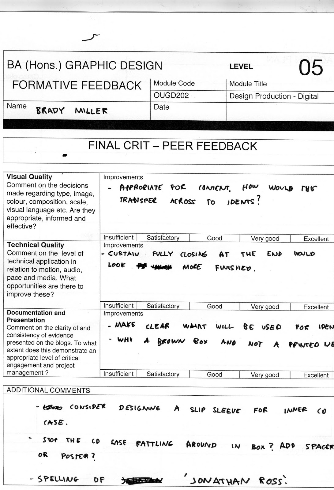
The idea of a title sequence is to set the mood of the show and present the programme details. In my title sequence I tried to keep the information as minimal as I could as the information would be in the actual programme. The TV idents were slightly harder as we only had ten seconds to get the information across and promote the show. The risk was either not giving enough information or giving too much. I think I managed to get the right balance by giving a small quote showing what the show was about and giving the details the time and date of the show and the channel it would shown on. In the brief it says the idents should repurpose assets from the title sequence therefore the idents needed to be in the same style as the title sequence otherwise it wouldn't make sense.

I chose to use kinetic typography for the quotes and created a stage which would be my composition. I had to bare in mind the screen was the format and what I created would be viewed on screen. My ideas changed a few times from the beginning after receiving feedback, which is definitely a good thing as it helped me progress. My initial ideas included more image based designs would I decided didn't work and my work would benefit from being mainly type based. After deciding the ideas I wanted to take forward I applied these through the skills I learnt in workshops such as After effects workshops with Mike, Workshops with Lorraine which taught us about action and title safe and using key frames. Without this knowledge I wouldn't have been able to move forward and apply them to my own study time. We also needed to do our own individual research into after effects to learn skills ourself. I now had newly acquired practical skills as well as existing ones to work with. We were also told we needed to have as much knowledge on our chosen subject are therefore I needed to do a wide range of research, primary and secondary.

Project Management was a bit part of this module also. I had to take into consideration the length of time it took to learn After Effects and apply them to my work. I also had to consider time for storyboarding. I needed to also give myself time to design and make my packaging for the DVD. This including making mock ups and test pieces.  

Top 10...

Top 10...


Top 10...


Title sequence Alternative outcome from Brady Rose on Vimeo.

Final Title Sequence


Title Sequence Final from Brady Rose on Vimeo.

Saturday 12 February 2011

Top 10...


Untitled from Brady Miller on Vimeo.

This is one ident i used the camera for. Because the audio of the comedian is so fast and so is the type is was hard to read what the type says. I therefore think this will just be an alternative outcome but not one of my final idents. I also do not like the fonts i used for parts of this ident, they do not fit in with the rest of the sequence. Because of the curtains, stage etc i have a limited space for the composition, this means i have less space for the type and with the type moving around the screen it seems like even less space

Top 10...


Untitled from Brady Miller on Vimeo.

For this ident i have also made the type move around the screen using the 3D camera. Again i don't think this works, the only part of this ident i am going to keep is the subtle image, the rats tail, i have used. I have kept the colour of the font the same in all the idents because i tried other colours but none worked with the dark background.

Top 10...


Untitled from Brady Miller on Vimeo.

I've tried to pick out the words which have the hierarchy and then making them larger than the rest, or bolder so show the importance of the word.

Friday 11 February 2011

Top 10...


Untitled from Brady Miller on Vimeo.

I've decided i really do not like the word burst actually bursting in this ident so i'm going to get rid of that.

Top 10...

I'm trying to find a font that shows 'Soft'. I have chosen the bottom font as i think the sans serif rounded edge shows 'Soft' the best.

Top 10...


Untitled from Brady Miller on Vimeo.

For some reason a small part of my ident has been cut off at the end, i will therefore re-do it and add an extra second. I have also forgotten to put Russell Howard's name at the bottom like i have done for Sean Lock. I will also add this when i re-do my ident.

I have just checked my quicktime videos and it seems to all be there. I will therefore leave the time as the videos i will actually submit are fine.

Thursday 10 February 2011

Wednesday 9 February 2011

Top 10...


Untitled from Brady Miller on Vimeo.

For some reason the curtains don't close properly on this video once i had rendered it whereas it did before.  I will try changing it and rendering it again.

Top 10...


Untitled from Brady Miller on Vimeo.

Top 10...

Final crit feedback


Tuesday 8 February 2011

Top 10...

Top 10...


Untitled from Brady Miller on Vimeo.

Top ten...

Top ten...


Top 10...

I have colour coded the different layers to make it easier for me

Sandstone is the type layers
Red is audio
Lavender is the stage layers

Top 10...


Untitled from Brady Miller on Vimeo.


27 seconds of my title sequence

Top 10...


Next part of my title sequence. So far it is 27 seconds, i am going to 
try and fit in one more short quote and then the title.

Monday 7 February 2011

Top ten...


Untitled from Brady Miller on Vimeo.

Timing on the type is a little off still, i am going to try and correct this tomorrow.

Top 10...