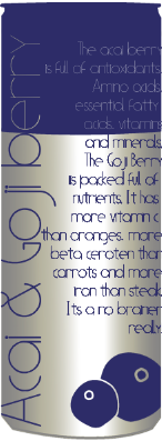
I have tried using the same font i used for the drink title
but it made the text too unclear to read therefore i am going to gil sans
as it a lot clearer to read.

I have done a few variations with the type centered to the right and the left. The one
to the left looks the best.
No comments:
Post a Comment