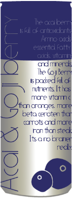
This shadow is more subtle than the one below which i prefer.
Showing posts with label Health drink design. Show all posts
Tuesday, 22 March 2011
Boost
In todays final presentation pitch the feedback i got was that there was too much text
on the front of the can. I therefore narrowed it down so there is only the necessary text.
I was also made apparent that in the title of the drink the word 'Goji' looked like two words, Go and ji
so i have split it into two words and put them closer together.
Monday, 21 March 2011
Boost
This is the can with the smaller type. It has gone from 12pt to 10pt and 9pt. I think the ingredient etc could even go slightly smaller.
Boost
We have designed and made some business cards to give to shop keepers to
promote the drinks being sold in their shop
Boost
This one of the posters. Its not yet finished i have just been trying variations of the layout.
I am going to print this out and put it around an existing can to see what
it looks like and if it works well.
Sunday, 20 March 2011
Boost
I have tried using the same font i used for the drink title
but it made the text too unclear to read therefore i am going to gil sans
as it a lot clearer to read.
I have done a few variations with the type centered to the right and the left. The one
to the left looks the best.
Saturday, 19 March 2011
Boost
I am trying to use just type to see if it works better than with image.
The light blue below makes the type quite hard to read so i have tried using a darker
blue which i think works a lot better. Although is still doesn't look feminine enough
so i am therefore going to try some different fonts.
Subscribe to:
Posts (Atom)